Free tool
Vanna & Charm Exposure Heatmap
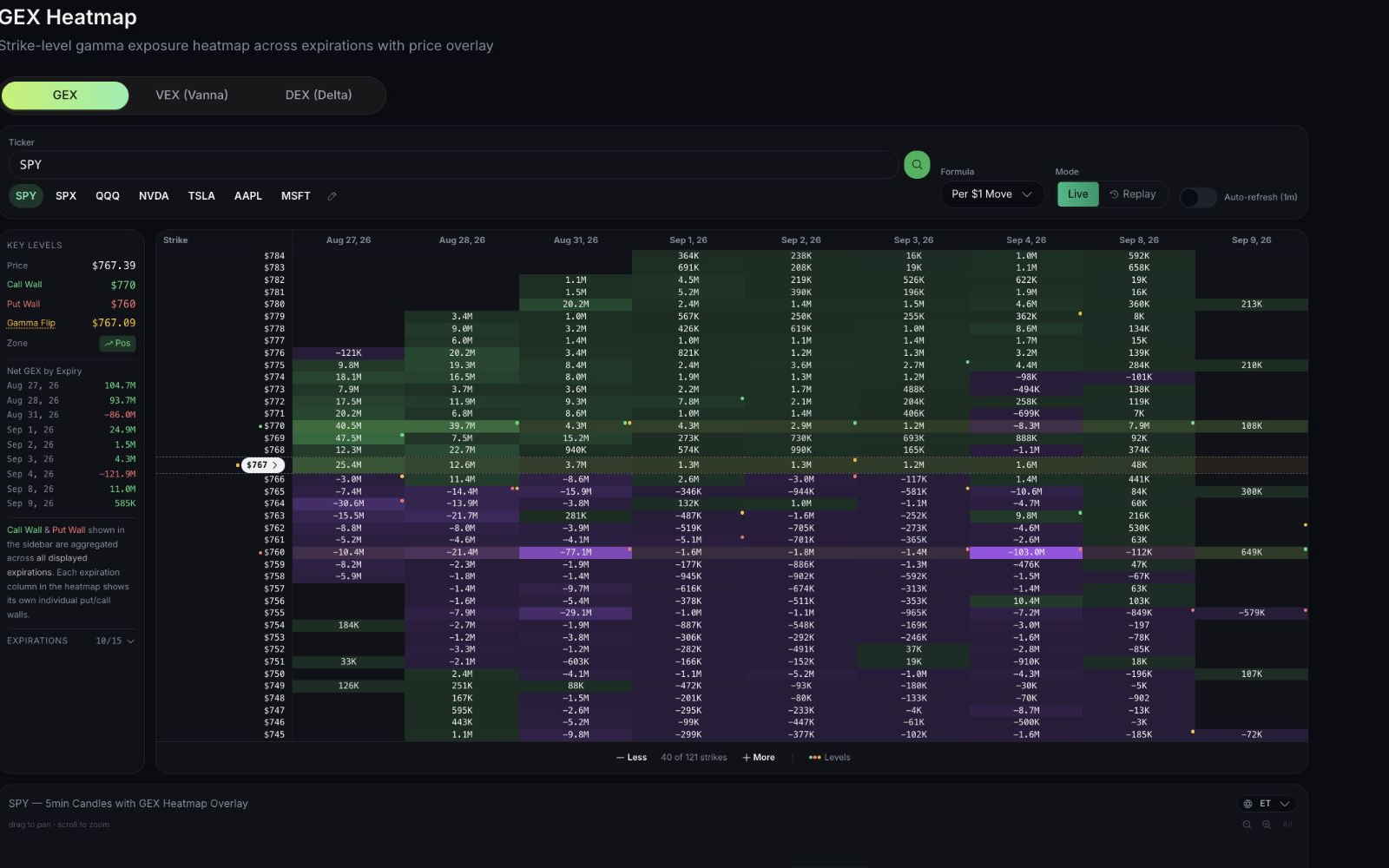
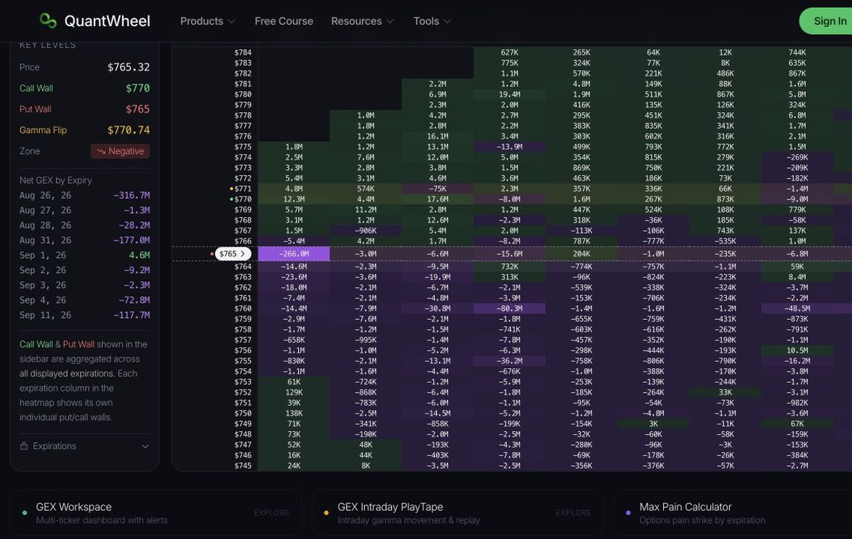
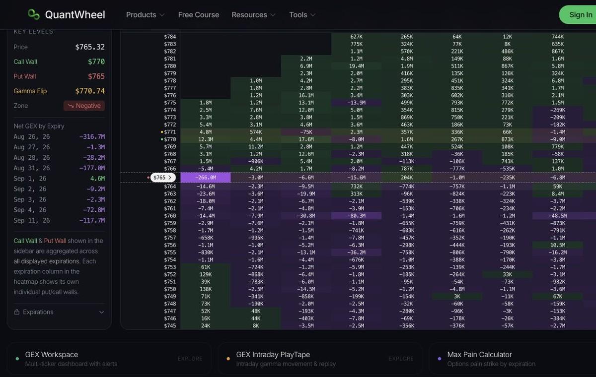
Visualize vanna exposure and charm exposure across strike prices and expirations in two stacked heatmaps. Vanna: green = positive, purple = negative. Charm: blue = positive, amber = negative.
Vanna & Charm Levels
Key levels, tenor buckets and expected move
GEX Workspace
Multi-ticker dashboard with alerts
Max Pain Calculator
Options pain strike by expiration
What is a Vanna Exposure Heatmap?
A vanna exposure heatmap displays modeled net vanna across strike prices and expiration dates in a color-coded grid. Each cell is net vanna at a strike for one expiration. Green cells are positive vanna. Purple cells are negative vanna. Color intensity reflects magnitude.
Unlike a single vanna chart that collapses expirations, the heatmap keeps the expiration breakdown so you can see which dates contribute the most vanna and how the vanna flip shifts further out in time.
What is a Charm Exposure Heatmap?
Charm measures how option delta changes as time passes with price and implied volatility held still. The charm exposure heatmap sits below the vanna grid and uses the same rows and columns, so you can read the two Greeks strike for strike. Blue cells are positive charm and amber cells are negative charm.
Charm concentrates in the nearest expirations because time decay accelerates into expiry. Large charm cells mark strikes where dealer delta hedges must be adjusted every session even if the underlying does not move.
How to Read the Vanna and Charm Heatmaps
Strike prices sit on the vertical axis and expiration dates sit along the top of both grids. A simple read of the bright cells:
- Bright purple vanna cells: Support on the downside when implied volatility rises.
- Bright green vanna cells: Slow vanna drift targets in a stable or decreasing IV regime.
- Bright charm cells: Strikes where passing time alone forces the most delta re-hedging, strongest in the front expirations.
- Key Levels sidebar: Total vanna, total charm, the vanna flip, and the net vanna regime across the displayed expirations.
- Net by Expiry: Net vanna and net charm for each expiration column.
Stronger color marks larger modeled exposure. Compare those cells with spot and with the vanna flip row.
Frequently Asked Questions
Next step
Where to go next
Try the whole product with sample positions. No account needed.